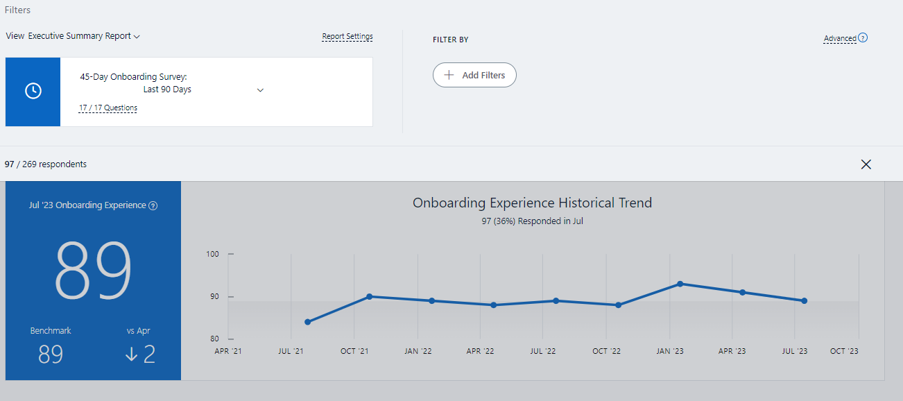
I am trying to pull numbers from our 45-day onboarding survey and I need help understanding the data comparison data. I have my overall Onboarding eSat as my main metric of the survey in which I have benchmark comparison and a date comparison. I have attached an image to showcase what I am seeing. I would understand if instead of vs April it said vs July as July is 90 days previous from today (October 12th, 2023), but my date comparison shows April. When I toggle to the Last 30 days, it changes to vs August. Again, I would assume last 30 days from today would be September. Any help or insight to help me understand this is much appreciated! Thank you!
 

@bekah.anderson I’ve created a support ticket for you.

Judy


Hello @bekah.anderson - 

When using the default time period:

  • The latest data point on the Trend Graph will be any surveys received from the past 90 days.
  • The next point will be the 90 days before the first data point (180 days - 91 days before today).
  • The next will be 90 days before the second data point (270 days - 181 days before today), and so on. 

The date that is displayed when you hover over data points will be Day 1 of that range, meaning that the most recent data point will have a date of 90 days before today's date (the date which is being studied). This date is not capped by the actual survey launch date, so a date from earlier than the survey launch date can be displayed on one of these data points.


You can learn more about ELC dashboard results here: Employee Lifecycle survey (ELC) - Understanding the Trend Graph | Glint Community (glintinc.com)


Thank you @Judy Weiner  and @kohayes for your support on this question! This was extremely helpful and clears it up for me. Thank you both very much!


Reply