Hi @vgrossma - check out this summary and video to better understand the Heat Map view - https://community.glintinc.com/documentation-28/heat-map-report-3-54-1114.
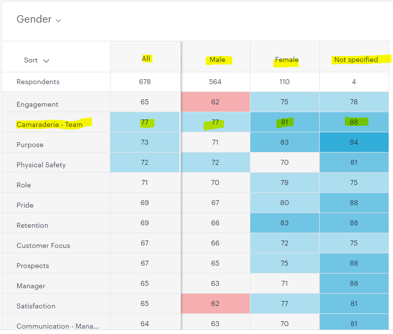
The rows below respondent each indicate a different question in the pulse, and the columns indicate how each group scored those items. So for camaraderie, women and unspecified gave a much higher score for this question than men. However, since they are significantly outnumbered, the average score for this item remains 77. Since all columns are in blue, this appears to be one of your higher scoring items, though obviously higher scoring still for women and unspecified (which is why they are in a darker blue).
You can also hover over any cell to pull up additional details and click on any cell to open a much deeper dive view into the information.
I hope this helps!
Brigid